Cover Design:
Bookstore Verses Online
Cover design has three parts: the front cover, the spine, and the back cover. The front cover displays the title, subtitle, and author's name. The spine, the part to which the pages are glued, contains the title and the author's name. The back cover is used to help sell the book. It also has a bar code with the ISBN number, which can be read with a scanner.
If the author is well known or is an expert in his field, he may include his picture and his credentials in the back cover design. If not, he or she may use the space to tell the reader what they will get when they read the book. It is also a good place to put favorable reviews.
You must leave a clear space (no text or images--the background color or pattern is okay) for the barcode. CreateSpace will superimpose an ISBN barcode in the lower right hand corner of your book's back cover. The ISBN barcode will be in a white box 2" wide and 1.2"tall. You do not have to provide the white box. It will be located ¼" up from the bottom of your book and ¼" in from the spine. You should leave at least ¼" safety margin on top and ¼" on the left. Therefore, you should leave an area 2.5" wide and 1.7" tall in the bottom right corner of the back cover clear of text and any meaningful images. This is pretty much the standard for all publishers, but of course, you have to check with each publisher.
The purpose of the front cover design in a store is to capture your attention from a distance and convey something about the contents, usually with an image. Online books are discovered with key word searches and the customer will only see a thumbnail image of your book's cover design. One of your first decisions then, is to decide if you want to design your book cover strictly for online sales, as it would be if you only used CreateSpace, or for display in book stores. As the illustrations below will show, a good cover design with colored panels and text can do both.
Remember, even if you use the major distributors, book stores will be reluctant to order a print-on-demand book from an independent publisher. They will special order your book if a customer asks for it.
What kind of an image can you put on a postage stamp and still have room for the title in large bold letters along with the author's name? By the time your customer actually sees the cover, she will have already have bought your book.
It is possible to use a picture on your cover. The challenge is to find a picture that relates to your subject, is recognizable at thumbnail size, and leaves room for the title, subtitle, and author's name. You can put type on top of some picture areas, but remember, the title must be clearly visible. Search on "microstock" to find an immense assortment of photographs at reasonable prices. Overall, it is easier to go with colored panels and contrasting type.
Colored Panels
Fortunately, some of the most attractive covers depend only on typography and colored panels. You can also use a solid color with a contrasting color for type. Textures, patterns, and gradients will add interest to a solid color cover. If you are handy with a digital camera, you can shoot your own textures. They are everywhere. The author has a library of several hundred textures, many of them from the backs of old tombstones. Do not use anything recognizable unless it pertains to your subject.
Be careful not to let a block of color end next to the spine. Instead, wrap it around the spine with some overlap. Cover printing is not always precise, and you could end up with an unexpected stripe of color where you did not expect it. Covers that use a solid color avoid this problem. Also, do not split any part of the cover into two equal parts. This causes the eye to dart back and forth. Instead, use the rule of thirds. Divide a section of the cover into thirds, as if you were going to play a game of tic-tac-toe. You do not have to be precise; you can even go down to one fourth or less; just do not split a cover into two equal parts.
On your next trip to the bookstore, see how many book covers you can find designed solely with typography and colored panels. Look online also. When you find a design you like, keep it in mind when you design your cover.
Geometric Designs
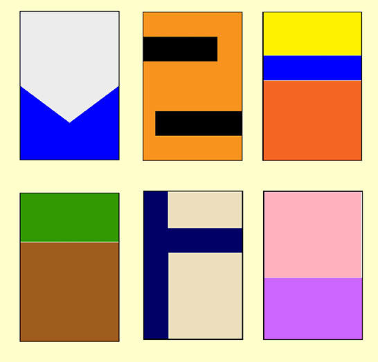
There are endless combinations of color and geometric designs to help your book stand out at the size of a postage stamp. I found the following designs on the internet.

As you can see, these are only the front covers. The de-signs will need to extend across the spine and on to the back cover.
One of your goals will be to ensure that your cover is legible at the size of a postage stamp. This means using a large sans serif font and contrasting colors. Capital letters are more recognizable than lower case letters when only a few words are involved.
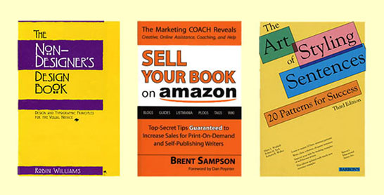
I found the these cover designs in my library. These are just a few examples to help you visualize your cover and to get the juices flowing. If you would like more cover designs, visiting the online bookstores is an efficient way to see hundreds of covers in just a few minutes..


When designing a cover without the help of a graphic artist, simplicity is the essence of elegance. Use only a few well chosen colors and a few panels.
Use CreateSpace's Cover Creator and you knowledge of Cover Design to create an attention getting cover.
Get access to FREE book publishing tools, resources, and a growing online community of authors. Learn how.
Right-click to download: COVER DESIGN WITH WORD 2007
Colors: match their meanings and implications to the theme of your book
Leave Cover Design and go to Home Page